 diglloydTools™


Newfangled Popup Password Dialogs Defeat Password Managers
I’m a delighted user of 1Password for managing all my passwords.
But two aggravating design trends have emerged within the past year, and seem to be growing:
- Web sites that hide login fields and force the user to click on a Login button or login link in order to reveal the username/password fields.. Major sites are doing this now. It’s particularly aggravating when a visual scan is needed to find that “Login” link in 8 point type buried among the detritus.
- Web sites that do the “hide” thing above, and then (worse) pop up a password dialog that won’t work with a password manager, at least not 1Password.
It’s classic “form before function” (very 'Apple'). But MPG can’t blame this one on Apple, because it’s popping up in too many places. It’s some mass design idiocy murmuration at play.
Update: 1Password is working for me now in the popup window. It did not work the day I wrote this, which puzzles me, and I have seen it not work on other sistes. Update 2: Sometime in the past few days, the B&H site had a major facelift (product pages change dramatically); something must have changed in regards to the login dialog too. The good news is login works with 1Password.
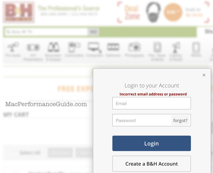
Shown below is what B&H Photo Video does (B&H is my recommended vendor for all things photographic). 1Password won’t fill in this popup password dialog on the B&H site, nor other sites that use this approach.
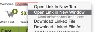
Workaround as shown at right: right click (control click) on Login, choose