
 diglloydTools™


Apple iOS 7: Type Weight and Size Impairs Usability, Presbyopia and Vision Issues
Related: Apple, Apple iOS, Apple iPhone and iPad, eyesight, iOS, presbyopia, usability
As age advances to 40's and older, presbyopia (difficulty focusing at close range) becomes an increasingly serious impediment, making small type harder and harder to read, especially in dim lighting where pupil size reduces visual acuity. Type that is small and thin is even worse for vision.
The presbyopia challenge is exacerbated by having strongly nearsighted vision that has been corrected with contact lenses and/or with eye modification such as LASIK: both of these things make close-range vision worse.
iOS 7 makes changes that do not work well for the eyesight challenges faced by anyone in their mid 40's on up: a choice of very thin typography along with haphazard support for type sizing on top of design changes that make it even harder.
Apple iOS 7
In particular, the new thin-font typography is generally harder to read for me than the older more substantial type used in previous version of iOS.
The adulatory discussion tends to take on abstract claims of being “cleaner” and more “elegant”, but these discussions conveniently omit the realities of vision for many older users. The idea that something is more elegant when it diminishes usablity reflects flawed premises as to the merit function.
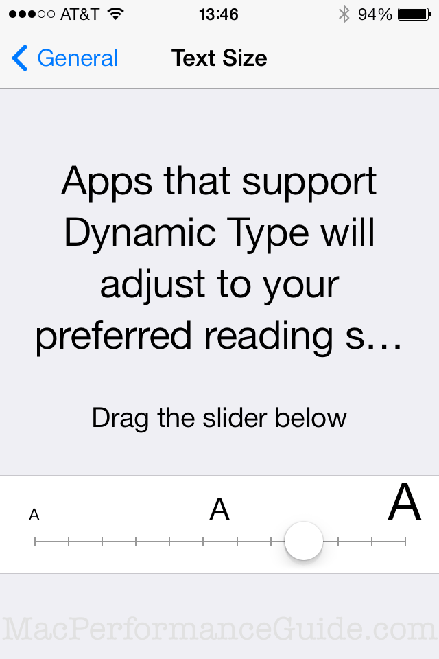
The Dynamic Type feature in iOS 7
iO7 has a dynamic type feature which is supposed to enlarge the type for readability, accessible through the area*.
Problem is, it applies piecemeal, even to Apple apps.
* Why several important features are buried under General with unimportant features at the top level is another questionable design judgment in iOS that suggests a failure to really think through the details of matters in the interface for usability. For that matter, the whole Settings area is a growing kitchen sink mess that needs a total rethink.
When Dynamic Type works
The good news is that this feature actually works and is very helpful in some areas, such as phone contacts as shown below, where the type has been sized-up as shown above.
I can read this type under most any conditions, including the most difficult challenge, dim lighting*, or through dirty sunglasses, or similar. I’d rather see more entries at once, but this works for me well enough.
* In dim lighting the pupils are of large diameter and just like a camera, there is less depth of field, and thus less tolerance for focusing variance.

MUCH larger than on an actual iPhone
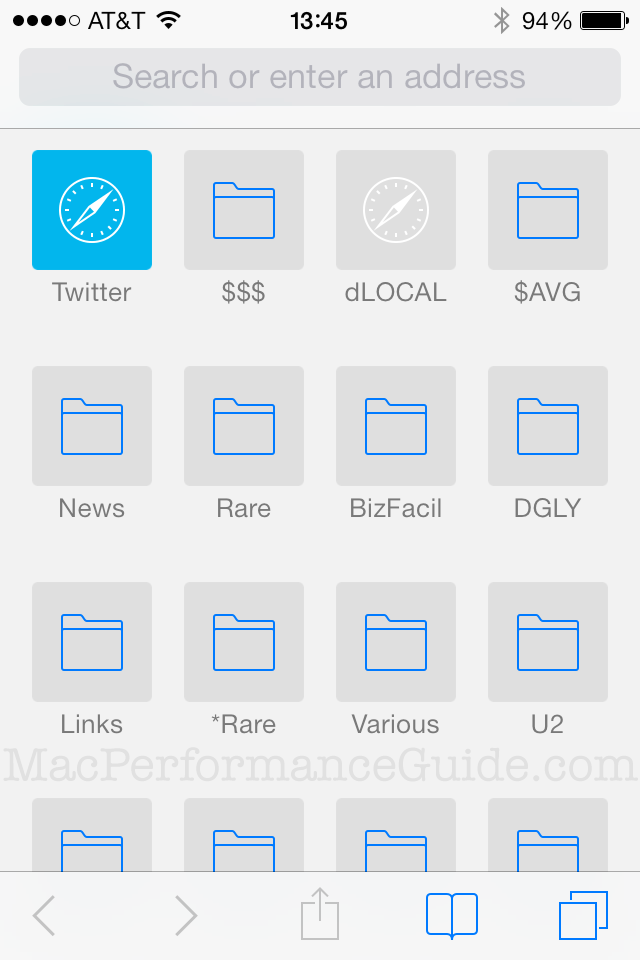
Degraded view of Safari bookmarks
The bad news and worse news is that the former highly usable list view for bookmarks has been transformed into an icon view instead, which wastes space while simultaneously degrading readability by using tiny type. The icons are purely a waste of space, when that space could be used for legibility, as in iOS 6.
MUCH larger than on an actual iPhone
In dim light I can focus on this type at a distance between 20 inches and 21 inches and that’s about it. It’s a strain no matter what.
So what Apple has done is to reduce a highly usable list view with high contrast highly readable type to a space-wasting iconized view with thin small type that is difficult to read. Go figure.
The changes show a lack of attention to detail and are consistent with changes in OS X*, where the utility of a proven design is discarded for the sake of just doing something different (Think Different?). It is not a promising trend.
Good design does not lock out users in a fundamental way. My same iPhone 4s running iOS 7 is harder to read in most places than with iOS 6 because of the new typography. One exception: the Stocks app uses a very nice white-on-black approach—highly readable.
* An emphasis on eye candy at the expense of really thinking hard about usability: making core functionality work 100% reliably and intuitively, not arbitrarily disrupting established practices (even my kids are turned off by ome parts of iOS 7). Apple iOS 7 has gone well down the path of land mines (behavior that comes out of nowhere) and non-obvious functionality. Unless substantial benefits accrue to a change, there should be high inertia in existing well understood user interface behaviors.
Actual physical size
On the actual iPhone, the image is 76mm high (as measured with a ruler).
I measured and sized the images on my 30-inch display on my Mac Pro. The images below are 76mm high on that 30-inch display (again, measured with a ruler). They are exactly the same physical size as on my iPhone: pretty darn small type for those labels on the Safari bookmarks.
Apple iOS7 Safari bookmarks
