
 diglloydTools™


$220 SAVE $130 = 37.0% Western Digital 16.0TB Western Digital Ultrastar DC HC550 3.5-in… in Storage: Hard Drives
|

$500 SAVE $75 = 13.0% OWC 1.0TB OWC Atlas Pro SDXC V60 UHS-II Memory Card (2-Pack) in All Other Categories
|

|

|

|

|

|

|

|

|

|
Font Smoothing in Snow Leopard and Leopard
Mac OS X has some undesirable behavior for font smoothing which can dramatically affect how text reads on screen, depending on your particular monitor.
This effect can drive some people batty, as I learned from a reader of this site.
Changing the font smoothing setting — Mac OS X Snow Leopard 10.6

Apple abandoned useful font smoothing user interface support in Mac OS X Leopard for a “moron setting” in Mac OS X Snow Leopard, leaving those with non-Apple displays high and dry with unattractive text display.
You’ll need to use Terminal to set things right (or at least better, which is not to say optimal).
Checking the global font smoothing override
On most systems, the global AppleFontSmoothing setting will be absent, so if you read the existing value, you’ll get a message to that effect:
llcMP:~ lloyd$ defaults -currentHost read -globalDomain AppleFontSmoothing
2010-03-28 21:31:38.215 defaults[9109:903]
The domain/default pair of (kCFPreferencesAnyApplication, AppleFontSmoothing) does not exist
Setting the font smoothing value
Setting a value “1’ works best on my NEC 30" display for most sizes of text. Here is how to change it:
llcMP:~ lloyd$ defaults -currentHost write -globalDomain AppleFontSmoothing -int 1
You’ll need to close and reopen your application to have the change take effect. The only settings I recommend are 1 and 2.
Deleting the font smoothing override
To remove the global setting entirely:
llcMP:~ lloyd$ defaults -currentHost delete -globalDomain AppleFontSmoothing
Changing the font smoothing setting — Mac OS X Leopard 10.5
Open the control panel and experiment with the settings. The best setting will depend on your monitor, and your own personal preferences.
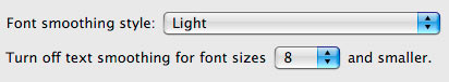
The effect does not take effect immediately; you must quit and restart a program to see the difference.
I recommend using Safari to view differences. The effect is most striking on pages that use light text on a dark background (view the blog page at diglloyd.com).
The effect can be quite pronounced on both appearance of the letters as well as the size and spacing. Here the only difference is using “12 point or smaller” versus “8 point or smaller”:


Examples
Here are samples of various font smoothing settings from my Mac Pro and the NEC 30" LCD 3090WQXi (an outstanding monitor).
It appears that is the same as . Both are awful, but the ugliest one is .
Only the setting provides results that don’t give me a headache. The effect is more obvious and more/less annoying when viewing an entire page (vs the limited size crops shown here).


Conclusions
You might be able to upgrade your Mac just by changing a setting, making it more pleasant to use every day!
